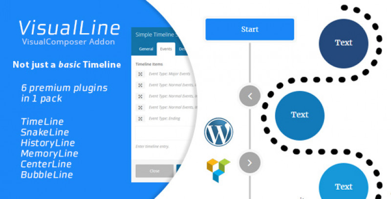
History Line Shortcode
VISUALCOMPOSER - GENERAL TABS
This shortcodes allows you to create a wrapper for the history element content. You can also specify whether to build the canvas point connector or not in this shortcode.

VISUALCOMPOSER - POINTER TABS
This Tabs allows you to define the default pointer settings which will be applied to all history content unless the history contents specify overriding settings.

Shortcode Formats
The following format example can be invoked manually outside the VisualComposer to generate the element.
Note : Wordpress doesn't allow new line inside the shortcode, you must remove all new lines and replace them with space when using the shortcode.
[history
  class="some class"
  id="someid"
  gradientone="hex to serve as gradient one fallback"
  gradienttwo="hex to serve as gradient two fallback"
  curvex="curve x fallback"
  curvey="curve y fallback"
  startx="start x fallback"
  starty="start y fallback"
  endx="end x fallback"
  endy="end y fallback"
  linewidth="line width fallback"
  linetype=" line type fallback"
  connector="true|false"]

    [historyinner
      id="x"
      class="class_one class_two"
      direction="left|right|center"
      image_attachmentid="wp attachment id or image url"
      image_size="the image size using numeric widthxheight or wp image size"
      image_position="the position for the image"
      border_color="the border color as vc border color"
      image_style="extra css class to style the image"
      icon_icon="fontawesome icon class"
      icon_size="the icon size utilizing fontawesome icon sizing"
      icon_rotate="rotate value for the icon"
      icon_flip="flip the icon or not"
      icon_spin="spin the icon"
      icon_border="the border value for the icon wrapper"
      icon_shape="the custom shape for the icon"
      icon_position="the position for the icon"
      icon_inner_padding="the padding for the icon"
      icon_font="the fontsize for the icon overriding the fontawesome icon size rule"
      icon_width="the width for the icon wrapper"
      icon_height="the height for the icon wrapper"
      icon_color="the color for the icon"
      icon_background="the background color for the wrapper element"
      icon_border_color="the border color for the icon"
      label_type="the type for the label according to bootstrap label types"
      label_fontcolor="the font color for the label element"
      label_text="the text for the label"
      label_background="the label background color"
      title="some title"
      title_class="extra css class for title"
      subtitle="some subtitle"
      subtitle_class="extra css class for subtitle"
      data_curve_x="numeric representing pixel value for quadratic curve control point x relative to starting point x"
      data_curve_y="numeric representing pixel value for quadratic curve control point y relative to starting point y"
      data_offset_start_x="numeric representing pixel value for offsetting the start x"
      data_offset_start_y="numeric representing pixel value for offsetting the start y"
      data_offset_end_x="numeric representing pixel value for offsetting the end x"
      data_offset_end_y="numeric representing pixel value for offsetting the end y"
      data_gradientone="hex value for gradient value one"
      data_gradienttwo="hex value for gradient value two"
      data_linewidth="numeric representing the width of the conneting line"
      data_linetype="butt|round|square"

      // Grids with dotted notation
      grids___columns___mobile="X"
      grids___columns___tablet="X"
      grids___columns___small="X"
      grids___columns___large="X"
      grids___offset___mobile="X"
      grids___offset___tablet="X"
      grids___offset___small="X"
      grids___offset___large="X"
      grids___push___mobile="X"
      grids___push___tablet="X"
      grids___push___small="X"
      grids___push___large="X"
      grids___pull___mobile="X"
      grids___pull___tablet="X"
      grids___pull___small="X"
      grids___pull___large="X"
      left_grids___columns___mobile="X"
      left_grids___columns___tablet="X"
      left_grids___columns___small="X"
      left_grids___columns___large="X"
      left_grids___offset___mobile="X"
      left_grids___offset___tablet="X"
      left_grids___offset___small="X"
      left_grids___offset___large="X"
      left_grids___push___mobile="X"
      left_grids___push___tablet="X"
      left_grids___push___small="X"
      left_grids___push___large="X"
      left_grids___pull___mobile="X"
      left_grids___pull___tablet="X"
      left_grids___pull___small="X"
      left_grids___pull___large="X"
      right_grids___columns___mobile="X"
      right_grids___columns___tablet="X"
      right_grids___columns___small="X"
      right_grids___columns___large="X"
      right_grids___offset___mobile="X"
      right_grids___offset___tablet="X"
      right_grids___offset___small="X"
      right_grids___offset___large="X"
      right_grids___push___mobile="X"
      right_grids___push___tablet="X"
      right_grids___push___small="X"
      right_grids___push___large="X"
      right_grids___pull___mobile="X"
      right_grids___pull___tablet="X"
      right_grids___pull___small="X"
      right_grids___pull___large="X"
    ]

      some content for the inner shortcodes allowed

    [/historyinner]

[/history]
Shortcodes Attributes
The shortcode above will accepts the following attributes.
| Attributes | Value | Description |
|---|---|---|
| gradientone | valid hex color value | Define the default gradient first color |
| gradienttwo | valid hex color value | Define the default gradient second color |
| curvex | number | Define x value for the quadratic curve point coordinate |
| curvey | number | Define y value for the quadratic curve point coordinate |
| startx | number | Define the starting point x offset, this can be used to adjust the starting point |
| starty | number | Define the starting point y offset, this can be used to adjust the starting point |
| endx | number | Define the ending point x offset, this can be used to adjust the ending point |
| endy | number | Define the ending point y offset, this can be used to adjust the ending point |
| linewidth | number | Define the size for the quadratic curve line in pixel |
| linetype | round|square|butt | Define the line starting and ending point shape |
| connector | true|false | Enable or disable the quadratic connector globally. |
| class | valid css class separated by empty space | You can inject additional css class by specifing the valid css class separated by empty space |
| id | valid css id | You can define custom css id by specifying valid css / html id string |
Related Product
Related Documentation